.svg)
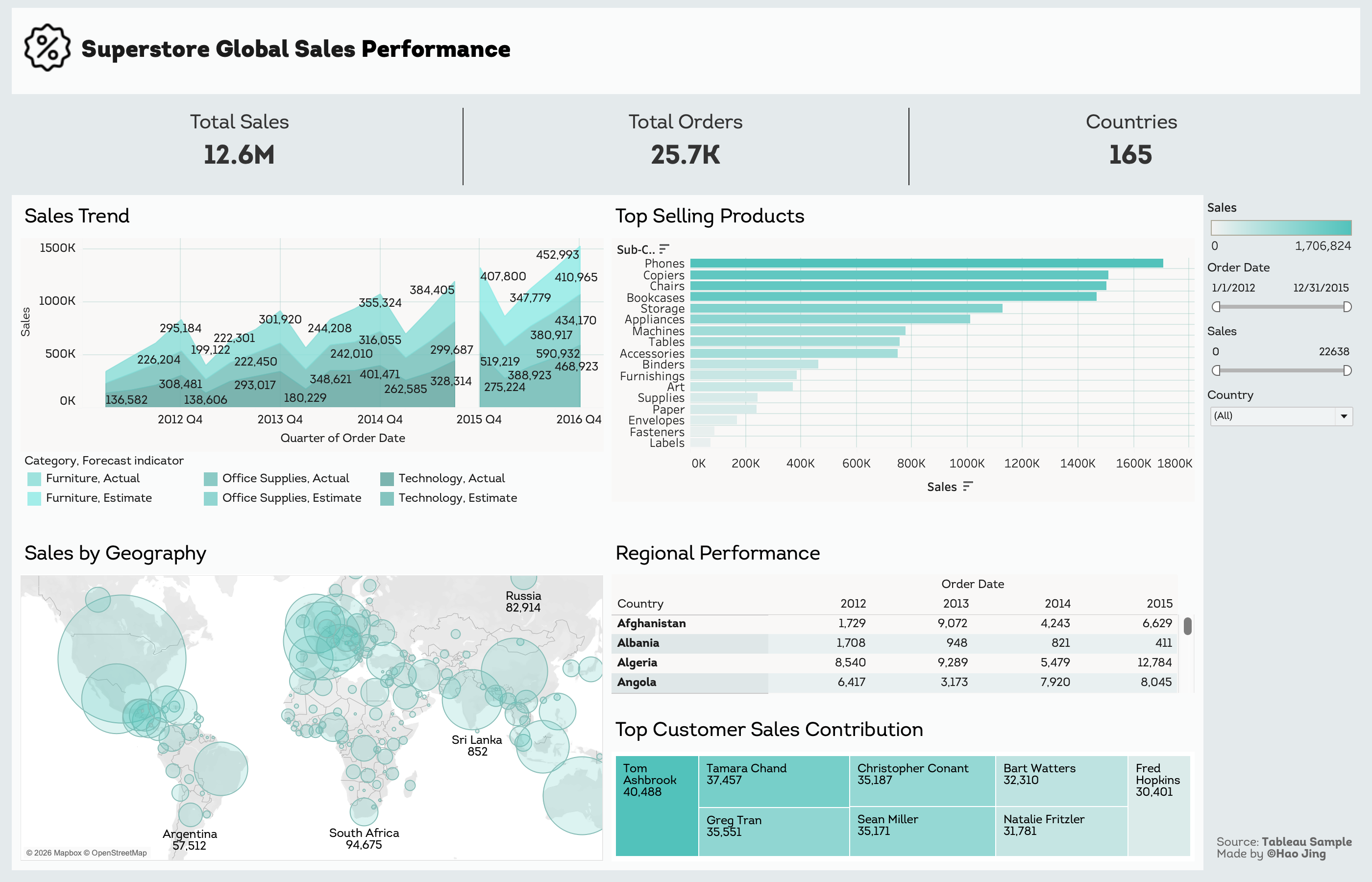
This dashboard tracks sales patterns across 165 countries and 17 product categories over 4 years. The goal was to identify where revenue comes from, where it's growing, and where potential risks might be hiding.
Source: Tableau Public | Superstore sample dataset
Seasonal sales pattern
The trend chart reveals consistent seasonality across all categories—Q4 peaks driven by holiday shopping, followed by Q1 drops. Overall trajectory is upward: both peaks and valleys increase year-over-year, indicating healthy business growth despite quarterly fluctuations.
Geographic concentration
USA dominates with $2.3M in sales (18% of total revenue), followed by Australia at $925K. The map visualization highlights this concentration—top markets account for disproportionate revenue share.
Product performance
Phones lead at $1.7M total sales. The category breakdown (Furniture, Office Supplies, Technology) shows Technology has the highest seasonal swings while Furniture maintains more stable quarters.
Customer distribution
Top 5 customers contribute $176K combined (1.4% of total), indicating no dangerous over-reliance on individual accounts.
Structured for executive overview (KPIs) with drill-down capabilities. Interactive filters allow exploration by date range, geography, and category. The quarterly view exposes seasonal patterns that annual summaries would mask.
Tableau Public
Explore the interactive version